What Is a Heat Map? A Complete Guide for Cybersecurity and Data Analysis
Updated on November 12, 2025, by Xcitium
Have you ever wondered how cybersecurity experts visualize millions of data points in real time? The answer often lies in heat maps — powerful tools that transform complex datasets into visual insights.
In today’s fast-paced digital landscape, where cyber threats evolve every second, knowing what a heat map is can help IT managers and cybersecurity professionals quickly identify risks, anomalies, and system vulnerabilities. From network intrusion tracking to data loss prevention, heat maps have become an integral part of modern security analytics.
What Is a Heat Map?
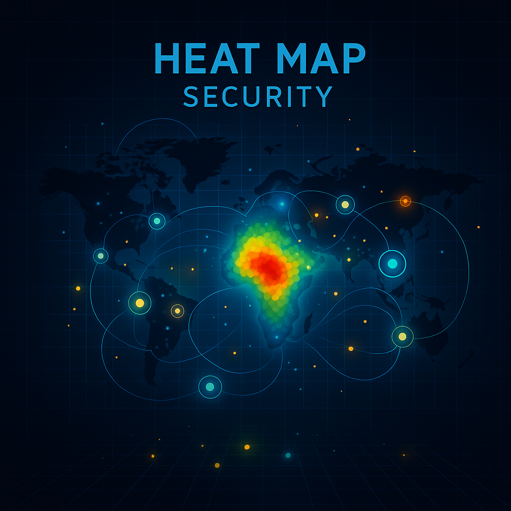
A heat map is a data visualization tool that uses color gradients to represent the intensity or frequency of data values across a specific area. It provides a visual “temperature” of information, where warmer colors (like red and orange) indicate higher values or activity, and cooler colors (like blue and green) represent lower ones.
In cybersecurity, a heat map helps detect potential threats, system inefficiencies, or vulnerabilities by making patterns visible that might otherwise be hidden in raw data.
Example:
-
In a network monitoring dashboard, red zones might indicate a high volume of failed login attempts — signaling possible brute-force attacks.
-
In endpoint management, blue areas may show devices with minimal activity, helping teams identify inactive assets.
How Heat Maps Work
At their core, heat maps process numerical or categorical data and assign color intensities based on values. The workflow typically follows these steps:
-
Data Collection – Gather data points (e.g., IP addresses, user activity, network traffic logs).
-
Data Normalization – Convert data into a comparable range for uniform scaling.
-
Visualization Layer – Map values to color gradients using software tools or APIs.
-
Interpretation – Analyze the heat distribution to identify trends or problem areas.
Tools Commonly Used:
-
Splunk
-
Grafana
-
Kibana (Elastic Stack)
-
Power BI
-
Google Data Studio
-
Xcitium OpenEDR dashboards
These platforms enable real-time heat mapping of data logs, making it easier for cybersecurity teams to visualize attack patterns and risk exposure.
Types of Heat Maps in Cybersecurity
Not all heat maps are created equal. Different types serve different functions in IT and security monitoring:
1. Network Heat Maps
Show data traffic intensity across systems or regions.
Use Case: Detect unusual traffic spikes that could indicate DDoS attacks or data exfiltration.
2. Risk Heat Maps
Display the likelihood vs. impact of various security threats.
Use Case: Prioritize vulnerabilities or compliance risks based on severity.
3. Threat Detection Heat Maps
Visualize suspicious user behavior or endpoint activity.
Use Case: Highlight anomalies such as unauthorized access attempts or privilege escalations.
4. User Activity Heat Maps
Track employee or endpoint behavior to detect insider threats.
Use Case: Identify high-risk users based on data transfer patterns or login anomalies.
5. Geographical Heat Maps
Map out attacks or connections across geographic regions.
Use Case: Reveal origin points of phishing campaigns or ransomware distribution networks.
The Role of Heat Maps in Cybersecurity
Cybersecurity professionals rely on heat maps to transform raw threat data into actionable intelligence. Let’s explore how.
1. Threat Detection and Response
Heat maps simplify the process of identifying patterns — for instance, repeated access attempts from a single IP range may instantly appear as a red hotspot on a network visualization.
2. Risk Assessment
By mapping the severity and likelihood of security incidents, risk heat maps allow CISOs to focus resources where they’re most needed.
3. Compliance and Auditing
Heat maps provide visual proof of data access control, endpoint compliance, and incident trends — making audits faster and more transparent.
4. Incident Management
During active attacks, real-time heat maps guide teams in containing breaches, identifying infected endpoints, and isolating compromised zones.
5. Strategic Planning
Executives use heat maps to visualize organizational risk posture, helping justify security investments or policy changes.
Benefits of Using Heat Maps in Cybersecurity
-
Faster Decision-Making: Instantly interpret security data through color-coded visualization.
-
Pattern Recognition: Identify recurring threats and abnormal network behaviors.
-
Improved Risk Communication: Translate technical findings into executive-friendly visuals.
-
Enhanced Endpoint Protection: Track devices with high-risk activity.
-
Better Incident Response: Quickly locate hotspots during real-time security events.
Common Applications Beyond Cybersecurity
While cybersecurity is a key use case, heat maps are equally powerful in other fields:
-
Website Analytics: Visualize user clicks or navigation flow (using tools like Hotjar or Crazy Egg).
-
Marketing & Sales: Identify high-conversion zones or lead performance.
-
IT Infrastructure: Monitor server loads, CPU usage, and bandwidth.
-
Healthcare: Track infection rates or medical imaging analysis.
However, in security, the visualization helps detect anomalies much faster than log-based methods.
Best Practices for Implementing Heat Maps
To maximize accuracy and usefulness, organizations should adopt these best practices:
-
Define Clear Objectives: Know what you’re tracking — threats, risks, or activity levels.
-
Use Reliable Data Sources: Integrate logs from firewalls, SIEMs, and EDR platforms.
-
Set Realistic Thresholds: Avoid false positives by tuning alert levels.
-
Integrate AI and ML: Automate anomaly detection using predictive modeling.
-
Ensure Data Privacy: Mask sensitive data before visualization.
-
Regularly Update Maps: Outdated data leads to poor security insights.
Heat Maps in Action: Real-World Cybersecurity Use Cases
1. Phishing Attack Monitoring
A global enterprise uses a heat map to visualize login attempts from suspicious domains. Red clusters indicate compromised employee accounts.
2. Endpoint Threat Analysis
An IT department leverages Xcitium’s OpenEDR to create a risk heat map showing endpoint health, vulnerability exposure, and patch status.
3. Cloud Workload Protection
Cloud security teams monitor multi-region workloads. A heat map displays which servers handle the heaviest traffic, aiding resource allocation and incident detection.
Challenges and Limitations
Despite their benefits, heat maps have certain constraints:
-
Data Overload: Too much data can make maps cluttered.
-
Interpretation Errors: Misreading color intensities can lead to false assumptions.
-
Real-Time Lag: Delays in data refresh can impact accuracy during incidents.
-
Requires Skilled Analysts: Understanding nuances in visual data demands expertise.
Future of Heat Maps in Cybersecurity
The future of heat map visualization lies in AI-driven analytics and Zero Trust frameworks. Integrating heat maps with machine learning allows predictive security — detecting potential breaches before they happen.
Emerging Trends:
-
Adaptive Visualization Dashboards
-
Cloud-Native Threat Heat Mapping
-
User Behavior Analytics (UBA) Integration
-
Real-Time AI-Enhanced Monitoring
As cybersecurity ecosystems become more complex, heat maps will remain central to threat visibility and risk governance.
Conclusion
So, what is a heat map? It’s far more than a colorful graphic — it’s a powerful visual tool that turns cybersecurity data into insight. Whether monitoring user behavior, detecting threats, or managing risk, heat maps enable faster and smarter decision-making.
By leveraging platforms like Xcitium OpenEDR, organizations can take full advantage of heat map analytics to strengthen their cybersecurity posture and stay one step ahead of attackers.
Transform your threat detection capabilities with real-time security heat maps and advanced endpoint protection.
👉 Register for Xcitium today and experience data-driven cybersecurity.
FAQs About Heat Maps
1. What is a heat map used for in cybersecurity?
A heat map helps visualize attack patterns, endpoint risks, and vulnerability levels across networks for faster incident response.
2. How do you create a heat map?
Use security analytics tools like Splunk, Grafana, or OpenEDR to collect, normalize, and visualize log data through color gradients.
3. Are heat maps only for cybersecurity?
No. They’re also used in marketing, IT monitoring, and business analytics to represent data intensity.
4. What are the benefits of heat maps?
They simplify complex data visualization, highlight trends, and enhance decision-making speed and accuracy.
5. Can heat maps detect real-time threats?
Yes, when integrated with live security feeds or SIEM systems, heat maps can detect and visualize threats as they occur.