What Is a Chart? A Simple Guide to Understanding Data Visualization
Updated on November 17, 2025, by Xcitium
Have you ever looked at a spreadsheet full of numbers and felt instantly overwhelmed? You’re not alone. That’s exactly why charts exist. If you’ve ever wondered what is a chart or how businesses use charts to make smarter decisions, this guide breaks everything down in a simple, conversational way.
A chart is more than just a picture—it’s a tool that transforms complex data into visual insights. Whether you’re working in cybersecurity, IT management, data analytics, or business leadership, understanding charts can help you make faster and more accurate decisions.
In this guide, you’ll learn:
✅ What a chart really is
✅ Why charts matter in modern businesses
✅ The most common chart types
✅ How IT and cybersecurity teams use charts daily
✅ Benefits, limitations & best practices
…and much more.
Let’s dive in!
What Is a Chart? (And Why It Matters)
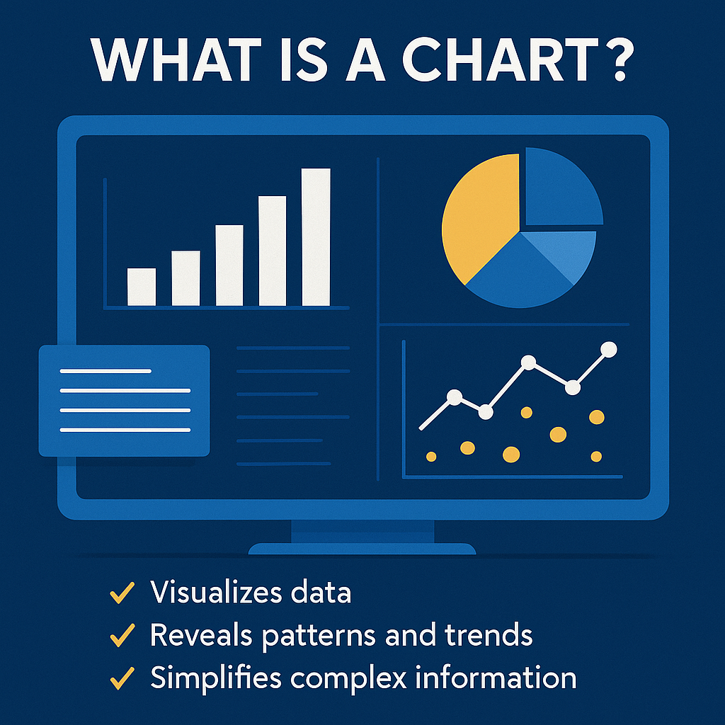
A chart is a visual representation of data. Instead of reading rows and rows of values, a chart simplifies the information by using shapes, lines, colors, and symbols. Charts make it easier to identify patterns, compare values, spot anomalies, and communicate insights clearly.
Simply put:
👉 A chart turns complex data into an easy-to-understand picture.
Charts are used in many fields, including:
-
Cybersecurity (monitoring threats and attack trends)
-
Information technology (server performance, network analytics)
-
Business operations (sales, forecasting, KPIs)
-
Project management (progress tracking, resource planning)
-
Finance (budgets, expenses, investment performance)
Because charts are universal, they enable teams across industries to communicate more effectively using visual language.
Why Charts Are Important in Today’s Data-Driven World
We live in an age of information overload. Businesses generate enormous volumes of data—from firewalls, cloud apps, endpoints, SIEM systems, CRM platforms, and more.
Charts help us make sense of all of it.
Here’s why they matter so much:
⭐ 1. Charts Simplify Complex Information
Raw numbers can be difficult to interpret. A chart displays trends visually—making insights intuitive.
⭐ 2. Charts Improve Communication
Teams across cybersecurity, IT, and executive leadership rely on charts to speak a common data language.
⭐ 3. Charts Enable Faster Decisions
Seeing a spike in threat activity or bandwidth usage helps IT managers respond instantly.
⭐ 4. Charts Reveal Patterns You Might Miss in Raw Data
Visual anomalies are easier to catch when displayed graphically.
⭐ 5. Charts Enhance Reporting
Whether presenting to the board or updating your team, visual data makes reports clearer and more engaging.
Common Types of Charts and When to Use Them
To better understand what a chart is, you need to know the different types and their uses. Here are the most popular chart types across industries.
1. Bar Chart
A bar chart uses rectangular bars to compare data categories.
✔ Great for: Comparisons
✔ Used by: IT managers to compare server loads, security analysts to track monthly threats
2. Line Chart
A line chart connects data points over time.
✔ Great for: Trends and forecasting
✔ Used by: Cybersecurity teams to track attack frequency over days/weeks/months
3. Pie Chart
A pie chart shows proportions or percentages of a whole.
✔ Great for: Distribution
✔ Used by: Teams analyzing budget allocation or device distribution
4. Area Chart
Similar to a line chart but filled in for better emphasis.
✔ Great for: Showing volume over time
✔ Used by: Network teams monitoring bandwidth consumption
5. Scatter Plot
Displays the relationship between two variables.
✔ Great for: Correlation analysis
✔ Used by: Data scientists and IT analysts to identify patterns or anomalies
6. Histogram
Shows frequency distribution of data.
✔ Great for: Identifying distribution patterns
✔ Used by: Security analysts when investigating event logs
How Cybersecurity and IT Teams Use Charts Every Day
When exploring what is a chart, it’s impossible to ignore its importance in IT and cybersecurity.
Here’s how charts support digital defense:
1. Threat Monitoring and Detection
Security dashboards rely heavily on charts to show:
-
Malware activity
-
Intrusion attempts
-
Suspicious IP traffic
-
Endpoint events
-
Anomaly alerts
With charts, analysts can instantly spot unusual spikes in threat activity.
2. SIEM and Log Analytics Visualization
Security Information and Event Management (SIEM) tools use charts to display:
-
Event volumes
-
Error trends
-
Firewall logs
-
User behavior analytics (UBA)
Charts convert millions of log entries into understandable patterns.
3. Network Performance and Health Tracking
IT managers use charts to track:
-
Server load
-
CPU usage
-
Network latency
-
Packet loss
-
Bandwidth utilization
A simple graph can reveal performance bottlenecks in seconds.
4. Cloud Security Dashboards
Cloud platforms (AWS, Azure, GCP) rely on charts to visualize:
-
Access logs
-
Vulnerabilities
-
Misconfigurations
-
Data flow patterns
-
Compliance risks
Charts help teams spot cloud security gaps before they turn into breaches.
Benefits of Using Charts in Business and IT
Here’s what makes charts so valuable:
✔ Faster insights
✔ Better communication
✔ Easier decision-making
✔ Visual clarity
✔ Improved reporting
✔ Stronger pattern recognition
✔ Simplifies presentations for executives
Whether you’re managing infrastructure or cybersecurity risks, charts make data easier to use, trust, and understand.
Limitations of Charts (And How to Avoid Them)
Charts are powerful—but only when used correctly.
❌ 1. Too much data can clutter the chart
✔ Solution: Keep it simple; show only what matters.
❌ 2. Wrong chart type can mislead viewers
✔ Solution: Match the chart to the insight you need.
❌ 3. Poor formatting reduces clarity
✔ Solution: Use consistent colors, labels, and scales.
❌ 4. Misinterpreted visuals can cause decisions based on bad understanding
✔ Solution: Always pair charts with brief explanations.
Best Practices for Creating Effective Charts
To make your charts more meaningful:
✔ Use clear labels
✔ Choose the right chart type
✔ Keep colors consistent
✔ Tell a story with the data
✔ Avoid unnecessary decoration
✔ Highlight key insights
✔ Ensure accuracy & proportionality
Charts should simplify—not complicate—the data.
Conclusion: Charts Make Data Understandable
Now you fully understand what is a chart and why charts are essential for IT, cybersecurity, and business decision-making. They make data visualization simple, intuitive, and accessible to everyone—from analysts to executives.
If you’re managing cybersecurity or IT operations, charts help you uncover insights, identify threats faster, and strengthen your security posture.
🚀 Ready to Strengthen Your Cybersecurity?
Use powerful threat detection and real-time visibility to protect your environment.
👉 Get started here:
https://www.xcitium.com/request-demo/
FAQ: What Is a Chart?
1. What is a chart used for?
A chart is used to visualize data, making it easier to understand patterns, trends, and comparisons.
2. What are the most common chart types?
Bar charts, line charts, pie charts, scatter plots, histograms, and area charts.
3. Who uses charts the most?
Cybersecurity teams, IT managers, data analysts, executives, and business leaders.
4. How do charts help in cybersecurity?
They display real-time threat activity, logs, attack patterns, and network anomalies.
5. Why are charts important in cloud computing?
They help visualize cloud security risks, traffic patterns, and compliance measurements.